Introduction
Taking care of Malaga’s sight is the daily objective for Óptica Barbarela. It´s a local business with excellence as a prominent value, which needed to update its identity after several decades of successful career of the previous brand.
The Fernández Entrambasaguas family turned to CREMA™ to renew their brand strategy, highlighting the quality of their services and bonds they establish with their customers.
Briefing
Since 1971, Óptica Barbarela has been growing in parallel with the development of Malaga as a city. They are currently present in five establishments, being able to attend to a large number of patients on a daily basis and they are now a benchmark in the sector.
In view of the expansion and specialisation of the business, the management identified the need to update its identity beyond a graphic renovation. CREMA™ developed a 360º project, integrating the brand, its online presence and retail branding in one global experience.




Research and strategy
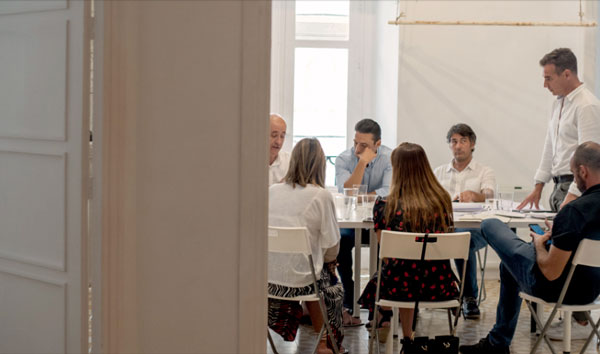
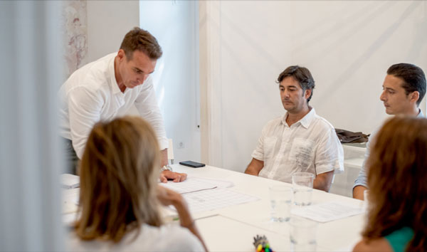
The creative team of CREMA™ launched a process of research and investigation using Design Thinking techniques, and involving management working groups and employees of Barbarela in those processes. This co-creative environment allowed us to analyse the reality of the business from all existing perspectives.
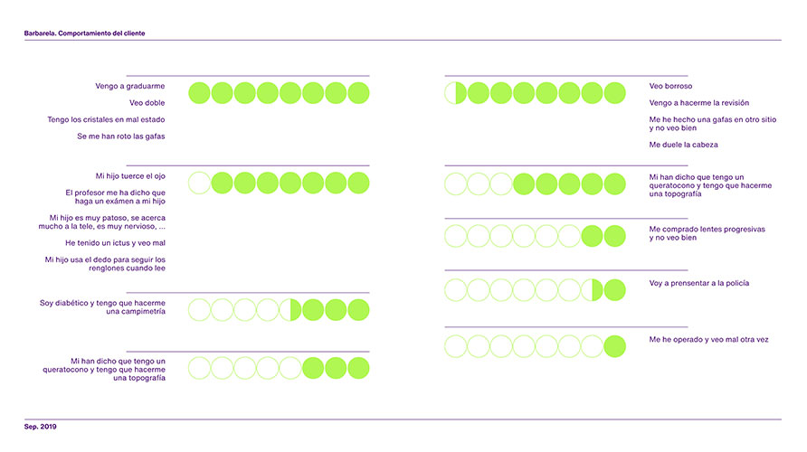
The link between the brand and the customer was studied in depth, especially the relationships established during the development of services. The customer's relationship with the brand goes beyond being a consumer; it is a patient and the focal point of all activity of Óptica Barbarela. This allowed us to concentrate the process of strategy elaborating on three fundamental ideas: Integrity, Safety and Málaga.
The project highlights the integrity acquired over decades of experience and the warmth of a neighbourhood business.
The definition of these concepts established the keys and working guidelines for the redesign project, allowing for essential decisions to be taken, as for example deleting the noun “óptica” in the naming, thus generating a change in brand perception, and providing a stronger and up-to-date vision: Barbarela.

Personality
Barbarela's communication works as a link between patients and employees and highlights the closeness which is transmitted in this relationship. Therefore, within the strategic definition of the brand, we have created a unique personality that would define the soul of the business and its position on the market.
This personality was built taking as a reference the archetype of the mother, who advises and guides for the sake of caring, quality, and comfort of her offspring. Barbarela is a caring brand, which accompanies the patient, and provides a scientific and professional vision, but also takes the time needed to find a solution to every problem concerning the sight or aesthetics.
The personality was enhanced by definition of the claim that endorses the brand, Te queremos viendo bien.We want you to see well. A declaration of will, which not only aims to sell glasses and contact lenses, but a brand that cares for and is a part of patients/customers’ life.
The design of an emoji version of the claim, allows us to adapt the brand to multiple environments by means of a current and direct language.
The design of an emoji version of the claim, allows us to adapt the brand to multiple environments by means of a current and direct language
Elements of the brand
New positioning of Barbarela was based on a more vivid and brilliant mark, containing shapes that inspire the future but also maintaining the roundness of the previous icon. Also emotional value has been emphasized while connection to the brand has been maintained and also specialisation of its services added as a value.

Logo
The logo merges the technique with the human side of the brand, that is why, a meticulous synthesis of the geometry of the type has been done, adding rounded forms that provide a harmonic character in the visual set, all of this resulting in a close and kind identity.
Color
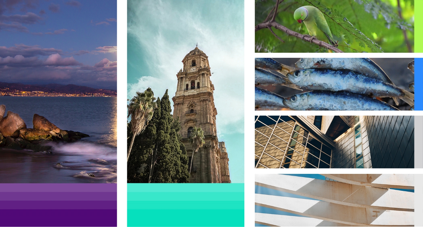
Malaga's personality is expressed through colour, so we put the city's flag on a lab table to define a solid purple colour with a dominant character and extracted two fresh shades of green that bring vitality and sophistication.
Typography
Choosing typography was a job aimed at reflecting the warm nature of the brand and expressing its integrity. Both typographies, the main and the complementary one, combine geometry and straight lines with rounded shapes and smooth contours, so that simplicity, functionality, and readability is achieved.
Grid
App development is based on a modular system that adds order and personality to composition, design, format, and supporting system. The lines of this grid connect with the geometric shapes of the other elements, which renders formality, typical for the healthcare sector.
Brand touchpoints
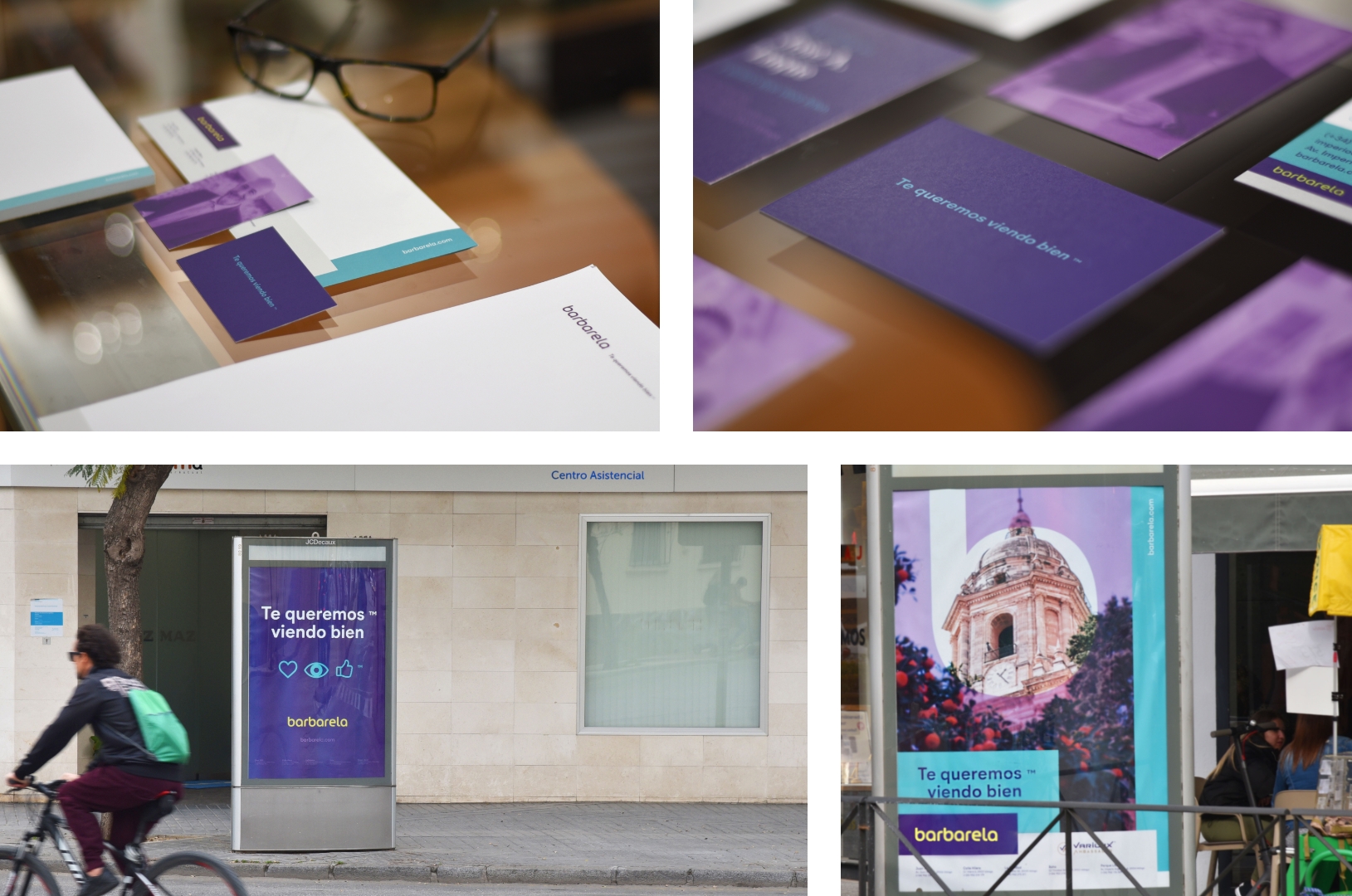
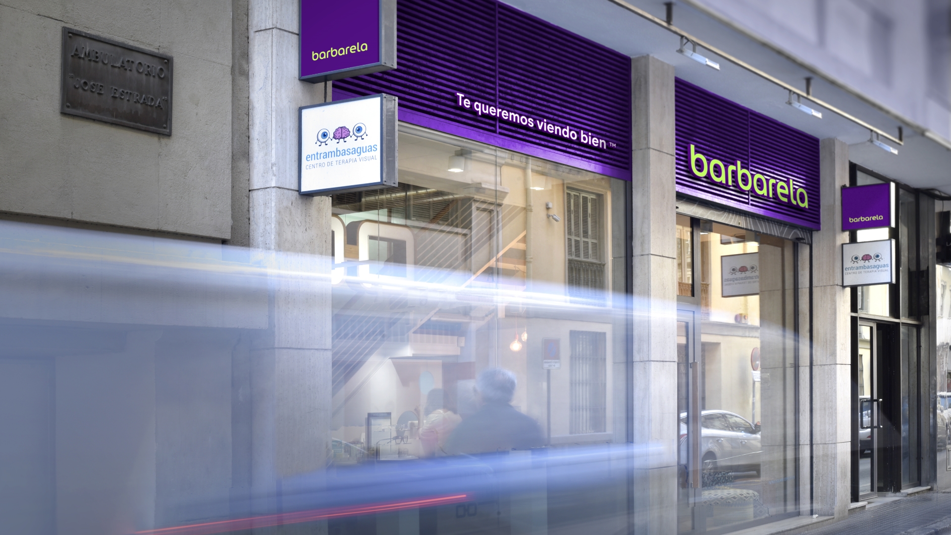
Half a century of history with their customers has made Barbarela a reference point in Malaga. Defining a 360º branding strategy allows the Fernández-Entrambasaguas family to face new challenges and continue to conquer the hearts of their fellow neighbours, never forgetting their main goal: to help their eyes see how they should.
Closing
The studio's work for Barbarela has marked a milestone in strategic positioning of the brand and in defining and redesigning of its identity. We have offered a new vision of the design in order to highlight all the characteristics of a brand with more than 50 years of business history. Our contribution adds up to great work done by the team and whole Barbarela company.


