Es|En
scroll
Introduction
With a century of history in its cellars, wine presses and storage rooms, Bodegas Dimobe exploits the cultural characteristics, topographic relief of mountains and biodiversity of the region of La Axarquía to create a wide variety of liqueurs and still wines under protected designation of origin of Malaga and sierras de Malaga, which range from red to sweet, dry and also vermouth wines.
The Muñoz Anaya brothers, responsible for these wineries, always in the process of innovation and search for new wines, experimented with the Muscat of Alexandria grape, processed in second fermentation in the bottle through the champenoise method and created a sparkling wine with special connotations. CREMA™ has joined the Dimobe project to bring design to a process that is both traditional and innovative.
Briefing
Naming worthy of representing the personality of this wine was the first phase of this project of brand building, creating label and packaging, which was to highlight the entire creation process that Dimobe was carrying out for this extraordinary product.
The field research and monitoring of the creation of the wine enabled the CREMA™ team, together with the ethnologist and the winery's team, define all the characteristics of the project, the process of which was carried out at the same time as the creation of the wine.
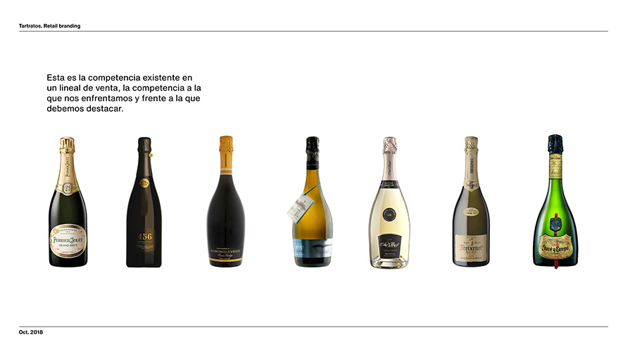
Another point considered was positioning of this new product on the market, which competes with high quality sparkling wines and cavas. Significant attention was paid to consumer understanding, expectations, and the sales experience.
Research and strategy
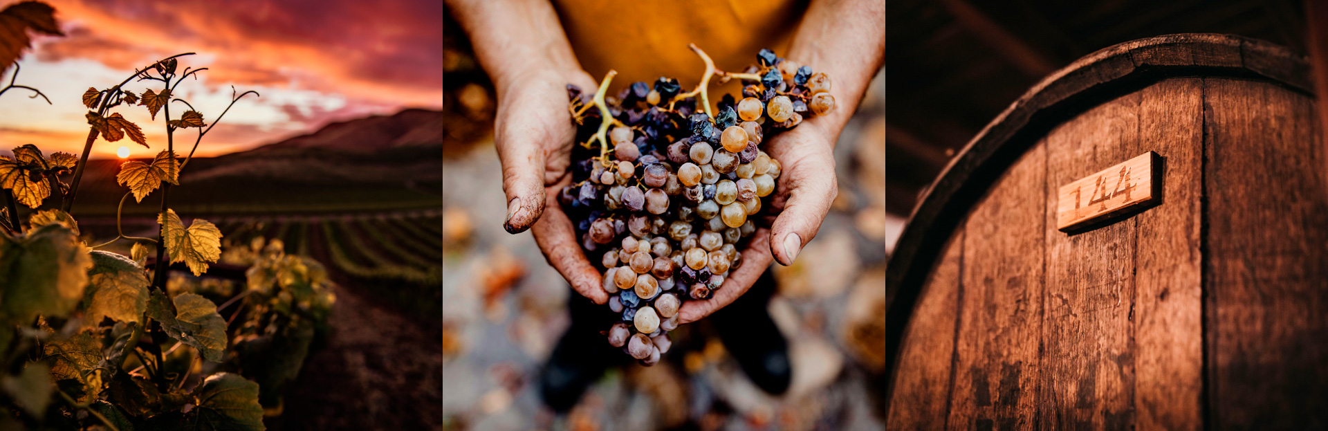
The research process was largely focused on fieldwork, although market data and consumer trends were analysed to compare results. Visits to the rugged terrain of La Axarquía, the monitoring of the measurement process in the laboratory and the maturation in the cellar completed each piece required during the development.
This experimental wine is a Brut Nature sparkling wine, which is harvested very early, using a traditional, artisan process. The brand and product strategy revolves around these qualities, always in line with the winery's vision. Experimentation and tradition are the strategic points of support in a project where sensations and the work process were key tools.
Market analysis and trend studies of the sparkling wine, cava and champagne sector.
Naming
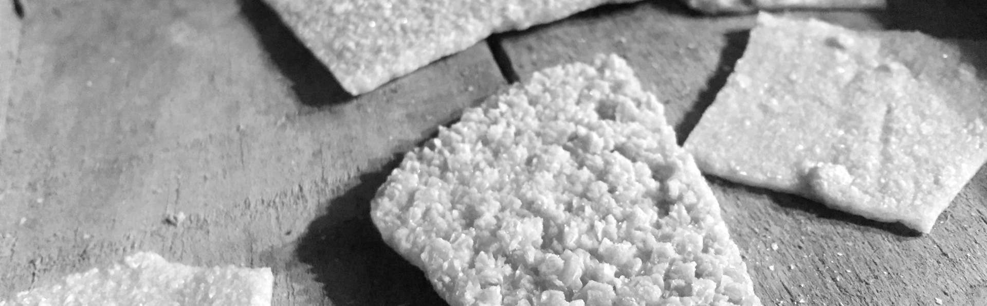
The process of immersion in the wine creation led to the discovery of elements, names and characteristics that surround the world of the winery and thus of this new wine. One of those discoveries were some fine calcareous layers that were deposited in the sediments of the first fermentation of the muscatel grape, with a sugary texture and earthy colour called: “Tartrates”.
Tartrate is a substance compound by a mixture of tartaric acid and a salifiable base. The name is a contracted noun compound by an adjective “tartaric” and a suffix “ate” that in chemistry means salt or ester that is compound by a given acid.
This noun brings in an experimental meaning suggesting chemistry and processes, which recalls its empirical nature, connection with tradition and history for its etymology. In addition, it’s a term that, that in spite of no harmonic combination of syllables, has an attractive pronunciation and is catchy.
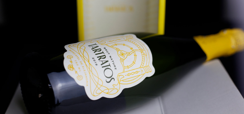
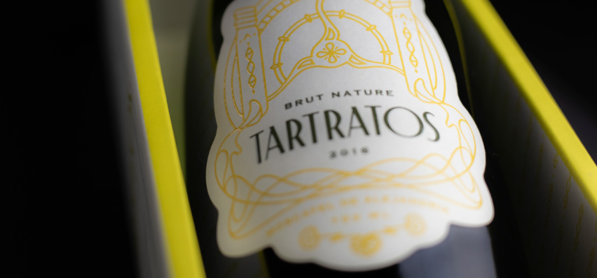
Elements of the brand
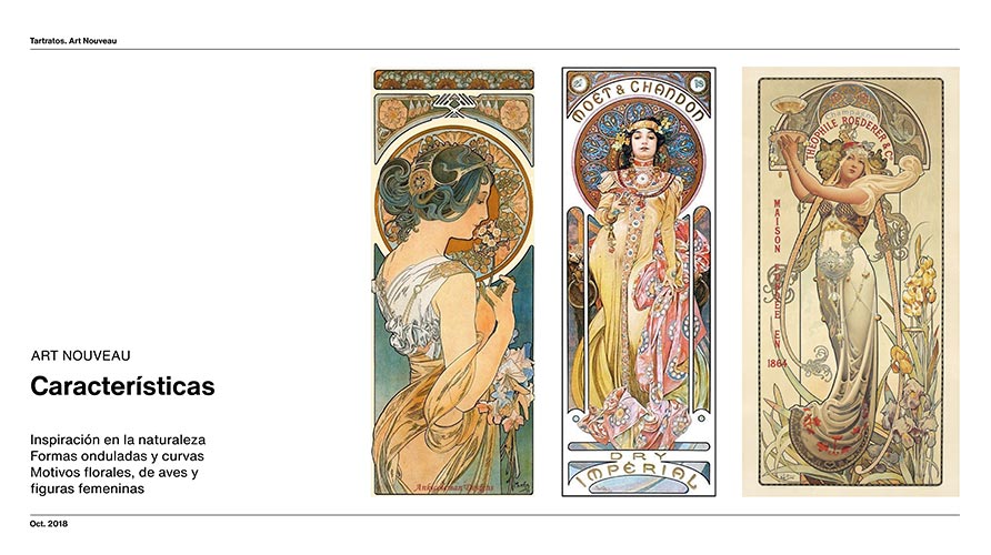
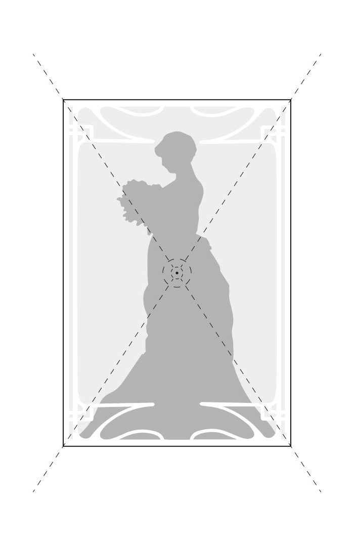
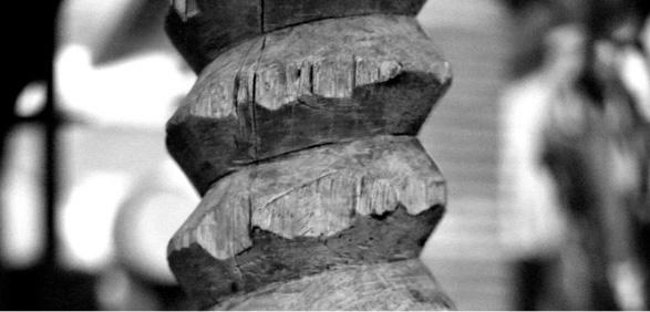
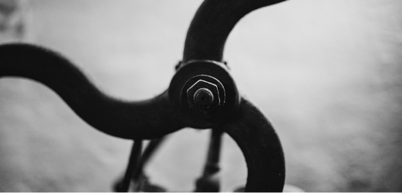
For the development of the brand through an 'eclectic' exercise, the team has taken references and trends from Modernism, finding inspiration in the composition of elements and their forms; and on the other hand, a synthesis of the decoration and design of vintage posters, antique tools, vestiges of craftsmanship and antiques that form the aesthetic universe of the winery. These elements are arranged, like in Art Noveau, revolving around a core composed by many details, thus generating a clean and complex composition at the same time.
The logo is created with a humanist style typography, with simple lines and it is also quite organic. It gives final shape to the name by providing, besides the human dimension, robustness, and rotundity by use of the upper case.
1
Art nouveau compositions are defined by symmetry.
2
The main focus is always in the centre.
3
The image is framed with complex, primarily floral ornaments.
Illustration
As part of the graphic universe, a series of illustrations are made that represent the history and the world that surrounds the process of creating wine. The most characteristic parts of each element are synthesised, creating sections that are part of an overall composition, which not only give it an aesthetic sense but also provide information and meaning in its background.
This interpretation, which is based on mixing elements and combining traditional aesthetics, acquires contemporary characteristic, due to the forms and execution of the lines representing, as a whole, experimentation, tradition, and history. This proposal is an effect of a process, same as wine, which is aligned with the key points and strategic plan of the brand.

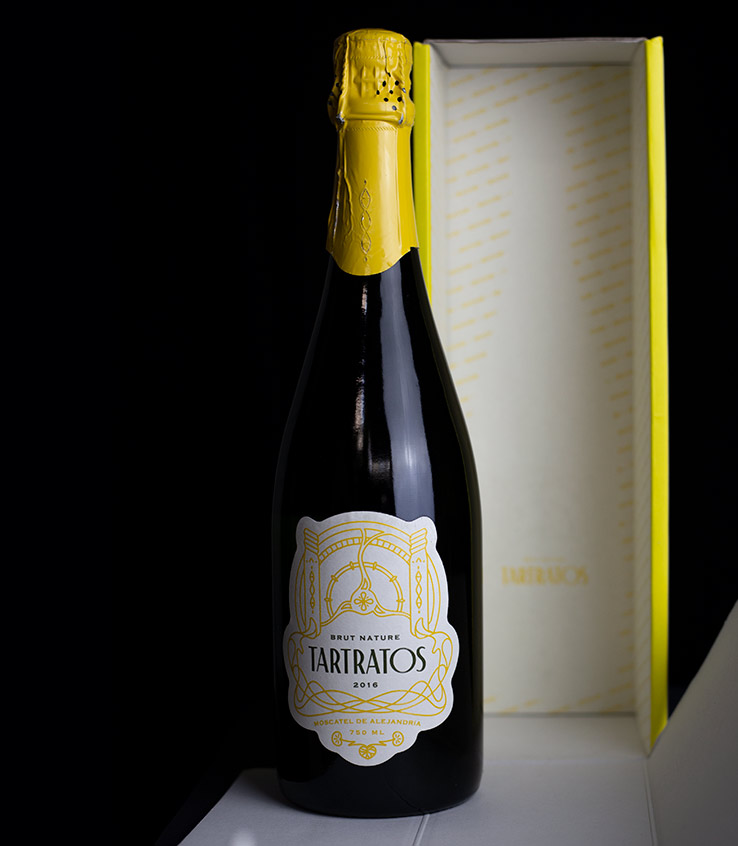
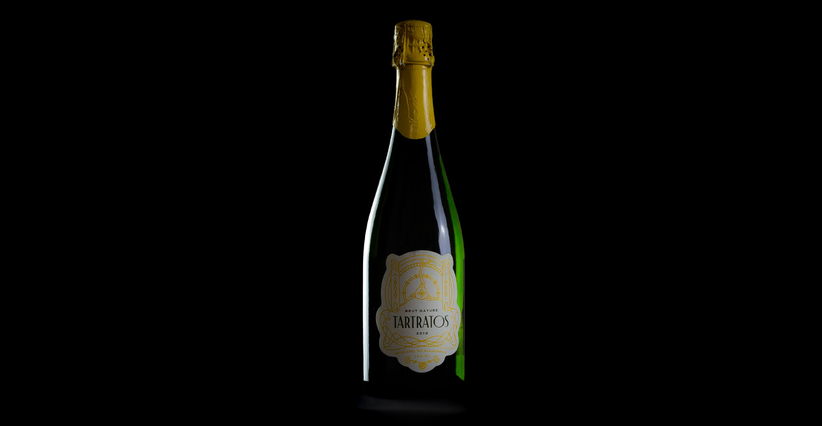
Packaging
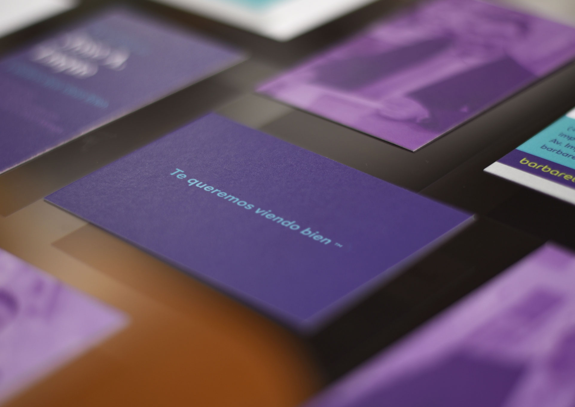
The design of the label, bottle and packaging is the link between the soul of the wine, its personality and its shape. Designed to stand out on gourmet shelves, it aims to stimulate consumer’s sensations from the first contact to being served for tasting. The use of colour is attractive, as well as reminiscent of the golden tones of sparkling wine. The textures of the paper on the label and packaging resemble the skin of the grapes before they are picked, the contours of the worn tools or the brightness of the light entering the wine cellar.
The organic and modular design of the graphic forms is used to create a piece or a die that wraps around all of the elements that compound the label. This allowed us to create a label that transforms and adapts to the universe of Tartratos, bringing in differentiation and meaning.
The presentation is completed by two packaging formats, a 12-unit box for the HORECA distribution line and a single pack for retail. The packaging made of corrugated cardboard, in both formats, is complemented by matt finishes that give a pleasant touch and others covered by varnish to provide texture and shine.
Closing
Tartratos is a complete project that includes creation of the brand, identity and packaging of a new wine from Malaga. It has allowed us to be part of the creation process, contributing with design and strategy to the idea of Dimobe. It is a project of branding and packaging that positions Dimobe and Tartratos, as a winery and a wine committed to tradition, with the seal of quality of La Axarquia, awarded twice with Premio Mezquita (2018 and 2019) and a Zarzillo price.
Immersion, being part of the creation of an experimental wine and working with the Dimobe team, has allowed us to put a name to a piece of the history of wine in the Malaga region, supporting it with our work during all the process.