Es|En
scroll
Introduction/Briefing
The law firm of Laura Torres and Javier Maestro, with offices in Marbella and Tenerife, specialises in legal and tax law and defends interests of national and foreign clients.
The team of lawyers who, until then, had used their personal brand name, asked CREMA™ to create its new commercial name and branding strategy with the aim of positioning the firm as an established company with an international vocation.

Research and strategy
The study of the business and service model is the central axis of the project's research. By means of canvas models we mapped the future work and vision of the firm. The analysis focuses the strategic proposal on the user/client, highlighting the results obtained by the firm and positioning it as a driver of success and new goals achieved by its customers. To reach the top and succeed.
In this feat scenario, a brand strategy is defined that evokes effort, courage, and success. A connecting point for this strategy is the conceptual image of the world of exploration and big accomplishments of great travellers as an idea in the mind of a client who visualises the victory.


Naming
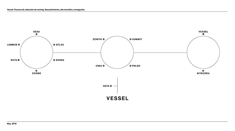
The construction of the name revolves around the concept of adventure and, for its creation, three imaginary settings are defined within this territory: the explorers, high mountains, and sailing. Each of them provides a different perspective for expressing the idea of accomplishment, thus reinforcing the strategic proposal.
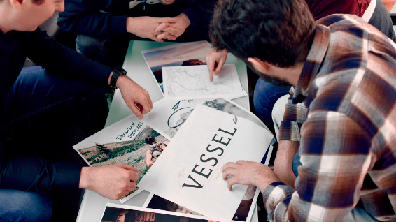
The development of names coming out of brainstorming sessions concluded with a semantic analysis of the terms and selection of VESSEL as the brand name. It´s a noun that sounds well, is short, has similar pronunciation in Spanish and English and its main meaning - ship or large vessel - is strictly related to the brand strategy. A great ship capable of crossing oceans and reaching its destination successfully.
Tax & Law Strategies is a valuable proposal that follows the name. Nouns such as "firm", "office" or "bureau" were deleted and the activity was addressed, instead. "Tax & Law" is used to indicate it, also serving the purpose of positioning the brand towards greater internationalisation. This is accompanied by "Strategies", a word full of meanings that impacts directly our imagination and that highlights the way in which the firm works.
Brand
The entrepreneurial and adventurous spirit of the brand is the strategic axis and conceptual point on which its development is based. A brand that speaks of reaching new goals, of victoriously overcoming obstacles, of aiming high and performing feats.
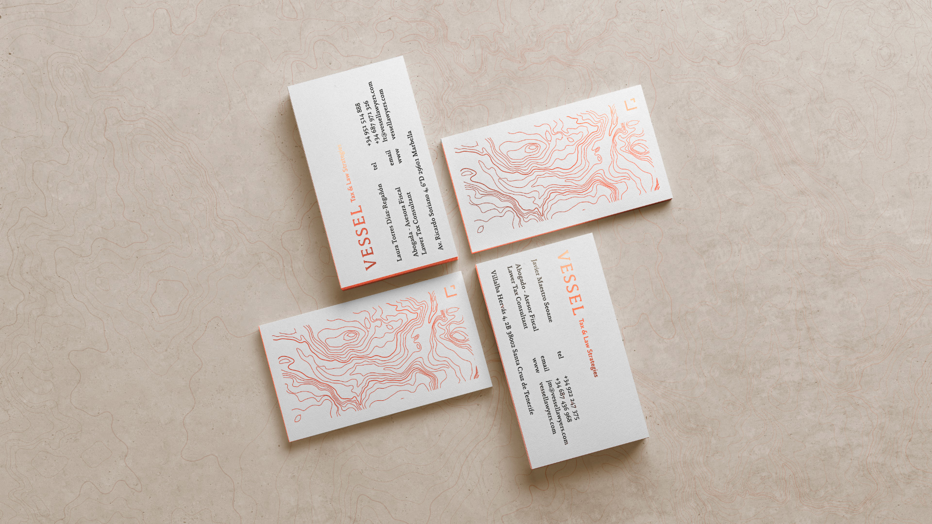
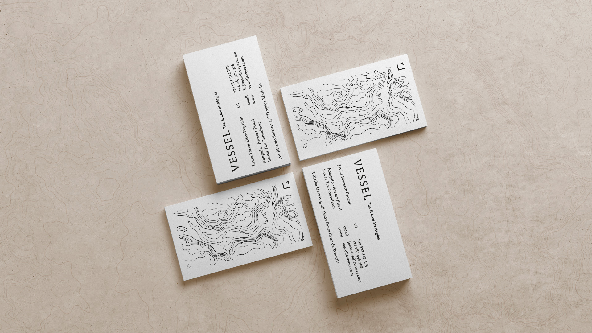
Logo
The verbal representation of the brand is based on the Absara typeface family. The typography has been modified by reducing the forms of the tops, achieving a more harmonious typographic structure, thus maintaining the contemporary features, without losing the strong personality expressed by its distinguished and robust characters.
Isotype
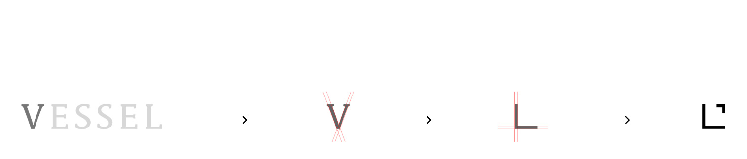
The symbol is the result of the transformation of the initial "V" of the name, which acquires a more solid and geometric character, resulting in an element of square shapes that complements the whole by providing strength, and confidence.
1
We take the V from the logo to start the composition
2
We remove the serifs in order to simplify the type figure
3
We rotate the figure, widening its opening in order to improve visibility in smaller applications
4
The figure is duplicated, reversing its position so we get an arrow that reflects the spirit of the brand

Color
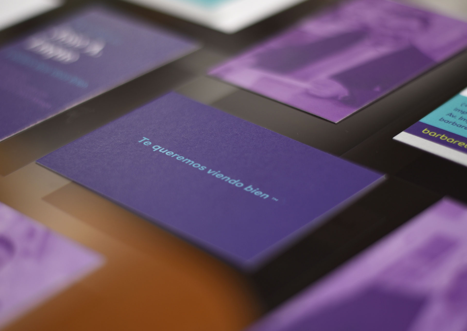
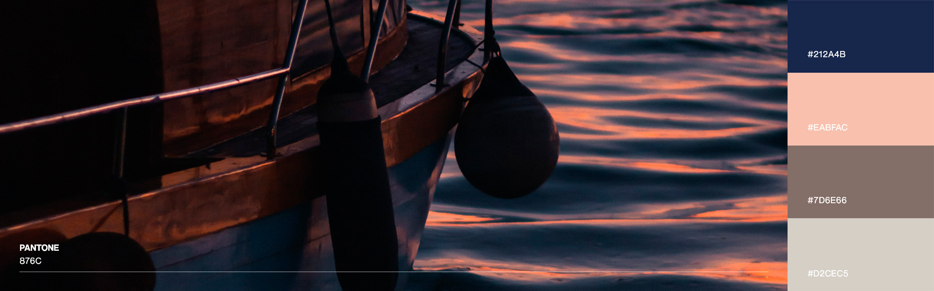
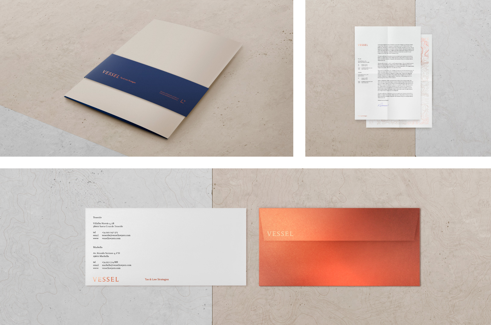
The colour applied comes from a sober colour palette, with neutral shades that transmit security to the client and position Vessel as a serious brand. It is worth stressing that the use of “Bronce Metal” from the palette gives recognition and differentiation to the whole.
Brand touchpoints
The Vessel universe is a symbol of sobriety. This is achieved through the application of neutral colours. This transmits confidence and security, positioning Vessel as a brand that puts the customer's needs at the centre of its services.
As a contrast, the use of bronze printing stands out. It is selective to avoid any stridency. Besides becoming a differential feature, it provides a sign of recognition and prestige thanks to the cultural association made with this metal. It is a historical symbol, used by goldsmiths in jewellery, utensils, medals and sculptures.
Closing
Vessel is a brand designed to position and consolidate itself on the international market. Its name represents a team of lawyers whose vision goes beyond the opening of new business lines and the brand is conceived as an engine of success for its clients, which conveys value, effort, and prestige.