Es|En
scroll
Introduction
By 2050, the European Commission expects 80% of electricity to come from renewable sources. A transition that implies a lower consumption of fossil fuels, which are limited and highly polluting.
In this context, in which a large number of renewable energy startups have proliferated, two young entrepeneurs from Malaga founded Ubora: a photovoltaic panel installation company. Carlos and Álvaro had several advantages under their belts that promoted their project beyond their rival start-ups:
1
They wanted to find a way to offer their customers a better user experience.2
They had obtained access to an exclusive Telefónica accelerator to promote their project.3
Their trajectory and the project they had prepared had given them a very privileged access to the Galileo system, the beta of the European Union’s new GPS system, given only to a very small group of projects.Despite Ubora's competitive advantages over its competition, whether bureaucratic or institutional, they lacked a brand that would convey this superiority to their future clients. Their team came to CREMA™ to develop a branding strategy that would take advantage of their business vision and the situation from which they started.
Briefing
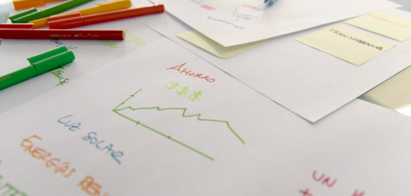
Ubora is a cleantech with the aim of achieving a clean energy installation on every roof. On their website, the user can learn about the potential savings in electricity costs that the installation of household solar panels implies, as well as the energy efficiency that their roof can achieve. Any consumer in Spain can benefit from this system, thanks to its large team of installers distributed throughout the national territory.
Thanks to the joint work with CREMA™, essential needs were defined for the brand: to create an identity that moves away from the market’s prevailing coldness, based on a strategy of closeness, empathy and knowledge of their consumers’ needs.
Research and strategy
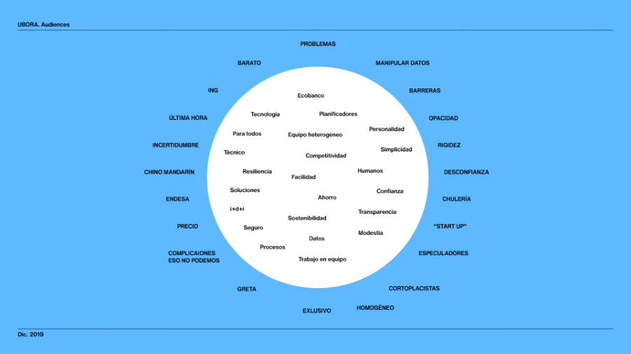
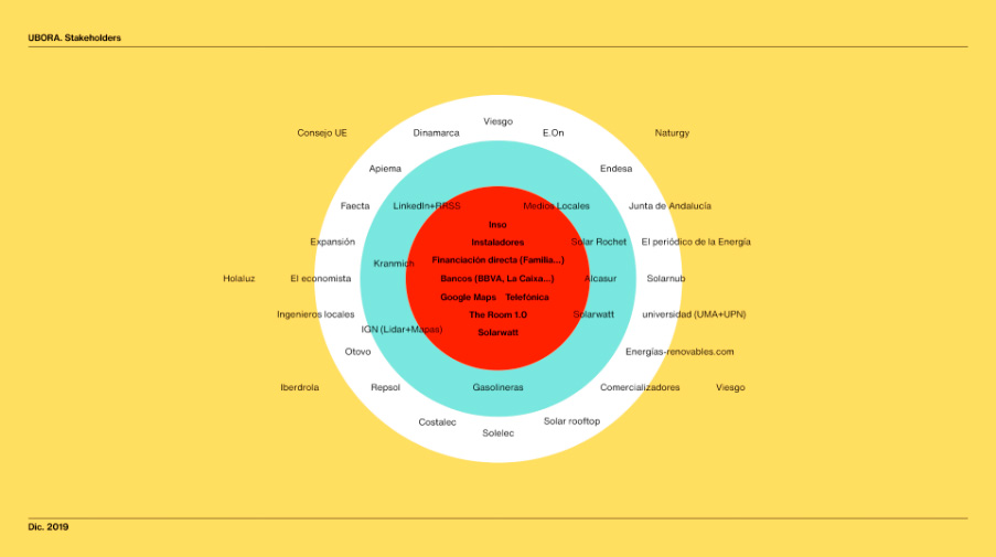
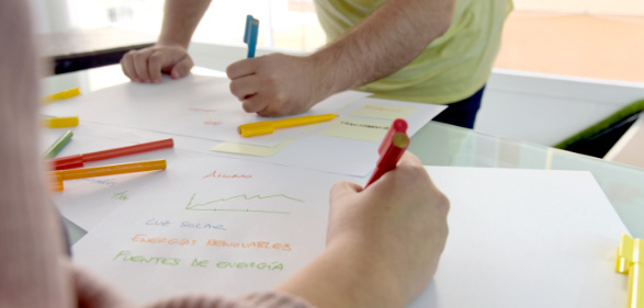
CREMA™’s creative team integrated the founders of Ubora into the research process, defining a schedule of sessions with Design Thinking techniques. Thus, the business and the public profile were better understood, exploring the formal and cultural scope of the company.
The joint analysis made it possible to define the purchasing process, finding the consumer's pain points and the proposal offered by Ubora: to offer a tailor-made energy solution, which involves the least possible effort for the customer.
This information made it possible to establish the brand strategy’s key points, focusing on the binomial of human and technology. This was expressed with the conceptual precision-empathy pair that influenced the entire process.

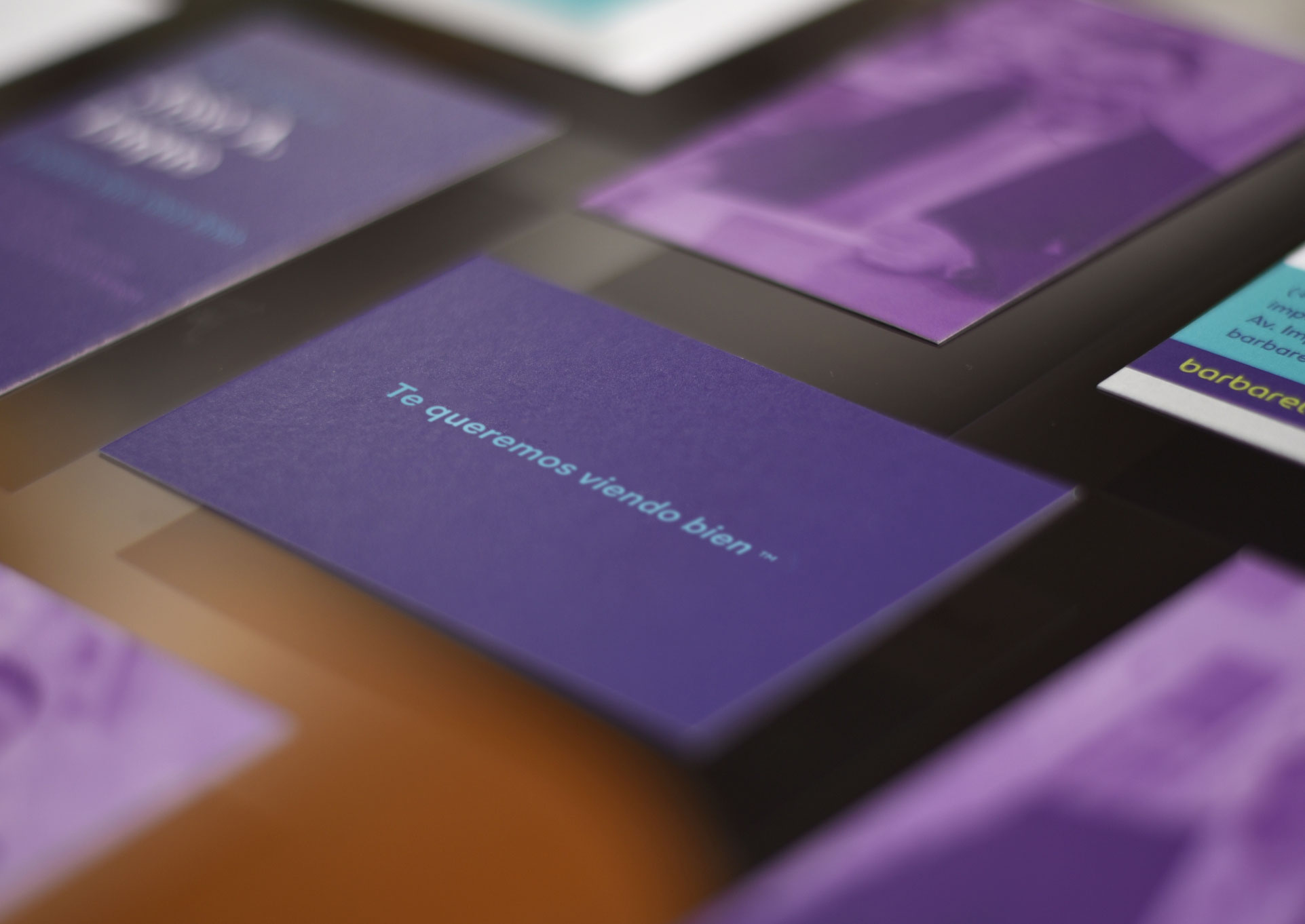
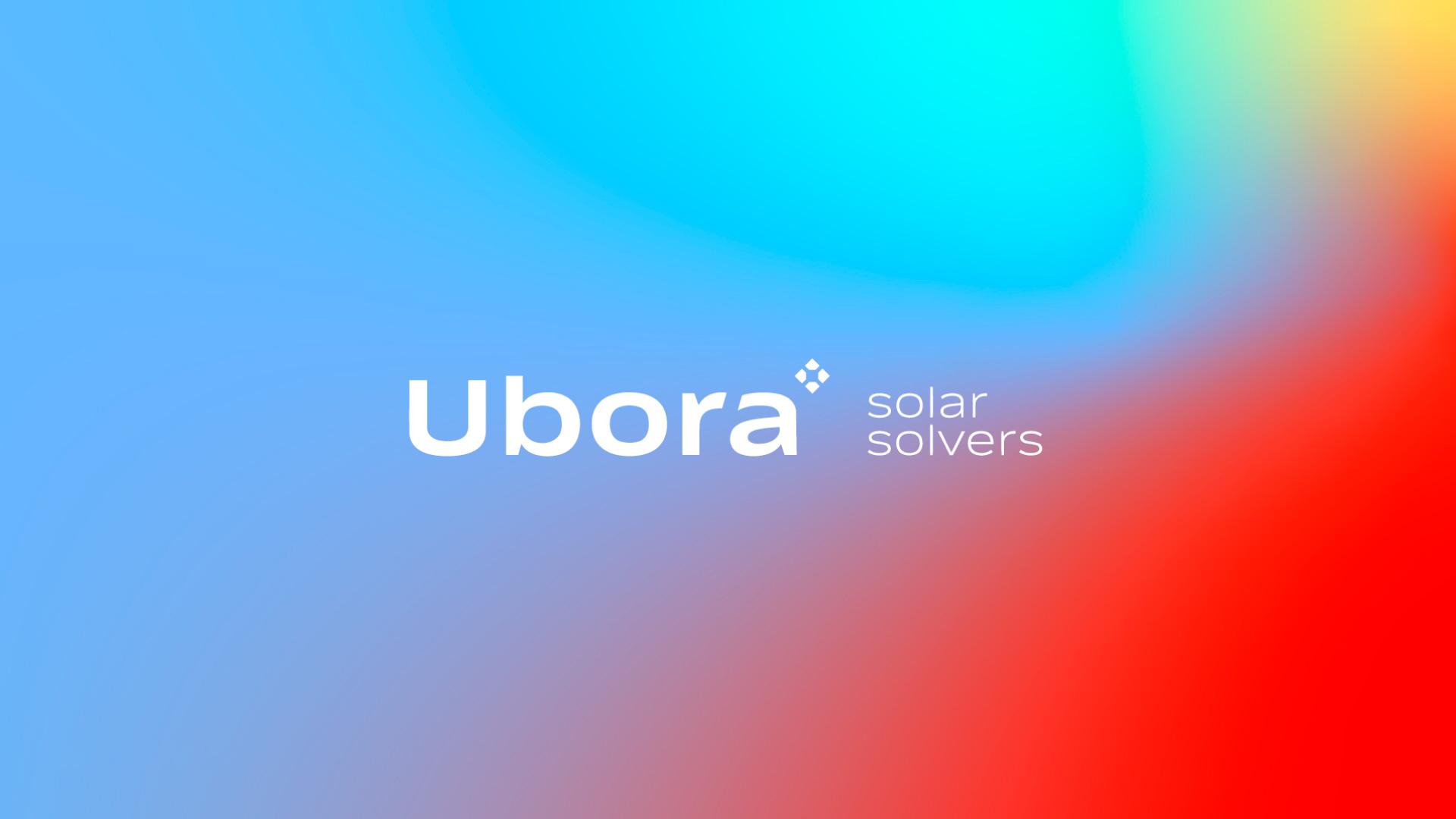
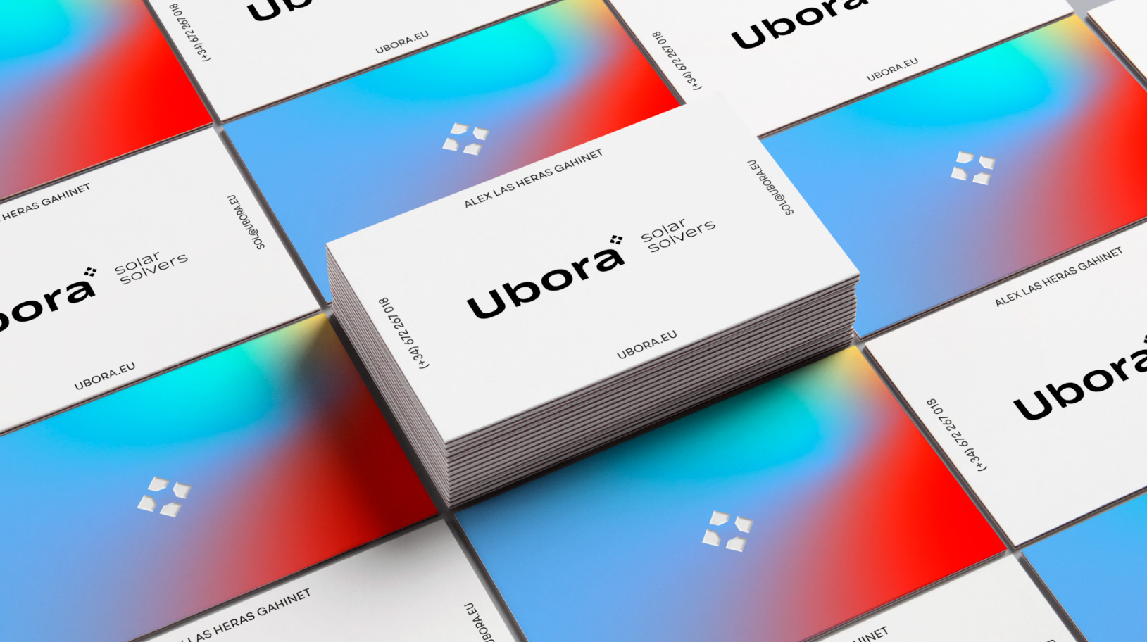
Logo
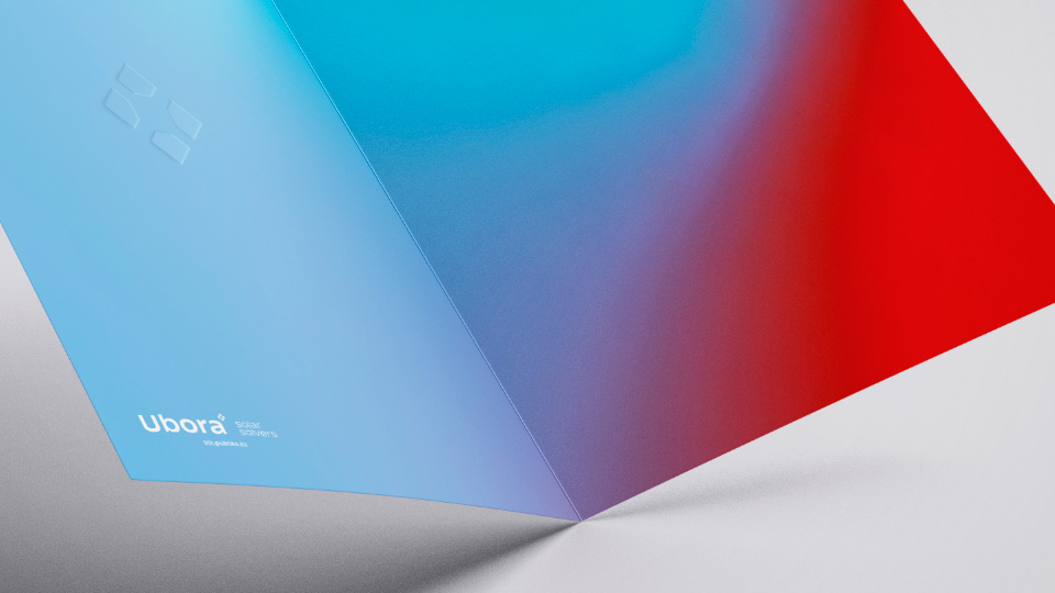
Ubora means “precision” in Swahili, a concept which contrasts with the softness in the sounds generated by the consonants b y r. This contrast present in the naming itself is reflected in the graphic development of the brand, especially in the logo and isotype.
For the creation of the logo, a sans serif typeface was used, modifying the angles of its vertices to unify and harmonize the whole. Thanks to the pronunciation in the curves in the typography, we manage to capture the most human side of the brand without losing the element of precision.
Isotype
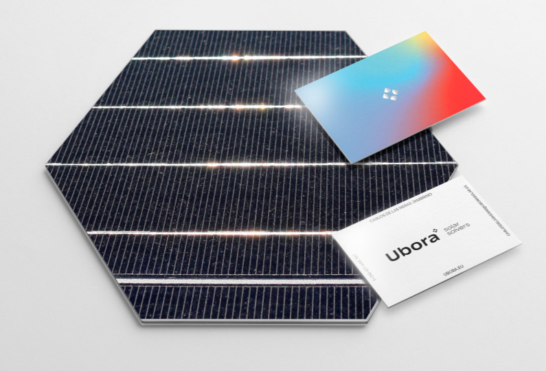
The work on the isotype was based on the minimum unit present in any solar installation: the cell. Taking as a reference the joints that hold the photovoltaic cells to one another, we took the negative space from these points of union. In this way, a target is built whose corners point to the four cardinal points, an element that allows it to be perfectly located in space as a symbol of precision.
Verbal identity and descriptor
In the solar energy sector, one factor predominates: communication focuses on the individual development of the consumer, carried out by doing a good deed with the environment. Thus, the connection with the authentic human environment of the user is forgotten: how electricity influences their day-to-day life.
From the sphere of verbalization, this was developed by placing the user as the center of communication.
Thus arises the brand descriptor: Solar Solvers, a declaration of intent by Ubora. The brand moves away from impersonal formulas, adding a soul and face: the customer does not have to choose between a variety of general solutions, but finds a response to their specific needs to make a tailor-made solution. In the formal aspect, the descriptor presents a repetition in the first syllable of both words. A soft sound that transmits closeness and warmth in its tone.
Claim
The construction of the claim allows to show the versatility of electricity in everyday tasks. This is achieved through a liquid claim, which empathizes with the user at each point of contact: from home to work or on the street, either alone or in the company of family and friends.
We use the word bright (luminous and intelligent) and develop the expression at your brightest (in the most brilliant / intelligent way). This message is completed with a verb that accompanies this expression, appealing directly to the actions that a person does in their daily life.
Color
The color palette revolves around a gradient effect, moving away from the sector’s typical corporate flatness, and employs two main colors, red (warm) and blue (cold), which emphasize the dual spirit of Ubora. They are supported by two complementary shades, yellow and turquoise, which follow the brand’s philosophy. The gradient formed by the combination of these four colors simulates the appearance of what we call a flare, the type of visual effect that occurs between lenses of optical devices when sunlight is reflected between them.
Blue
#80B8FF
Yellow
#FFDE69
Red
#ED2603
Aquamarine blue
#A1EBDE
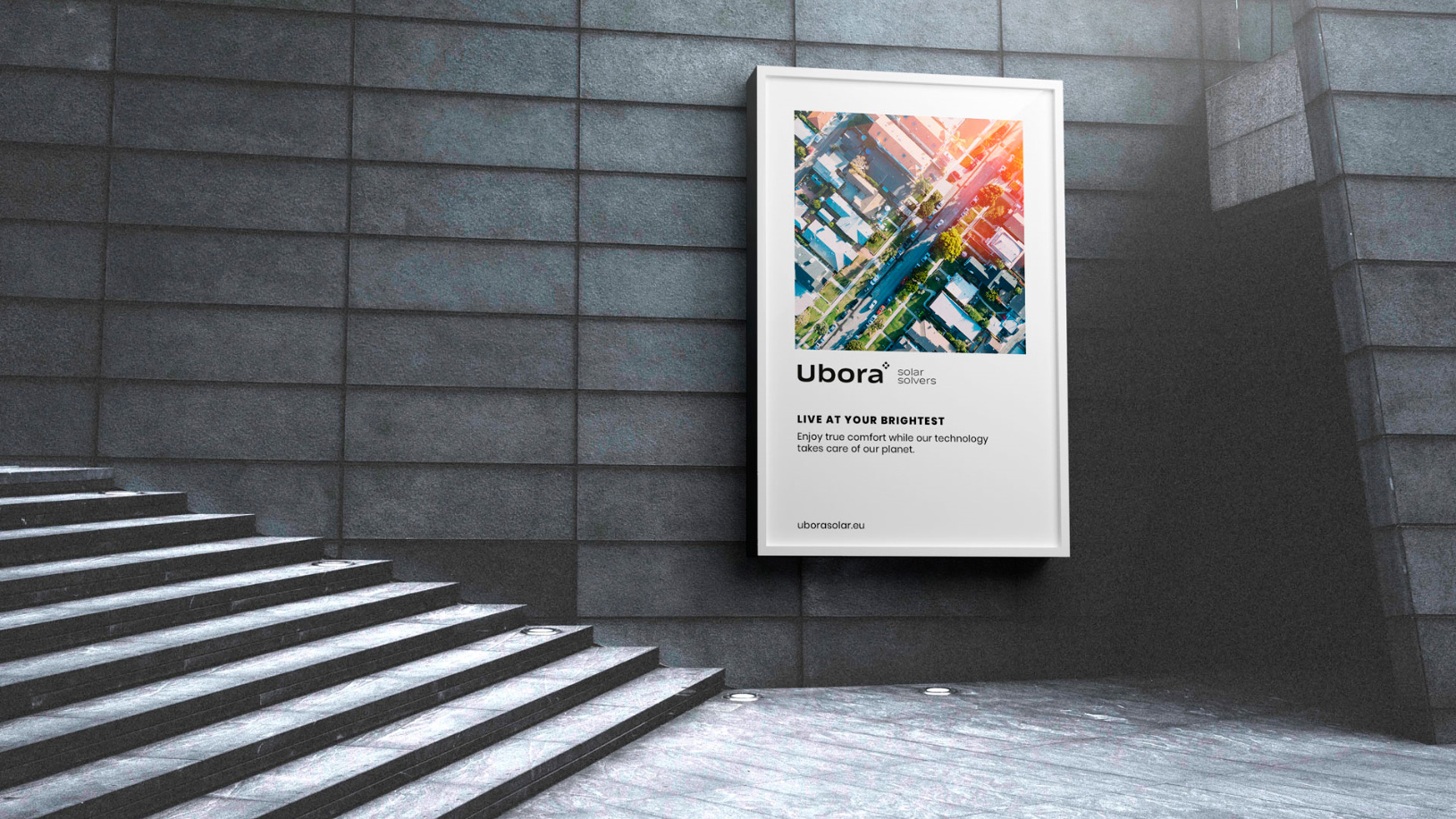
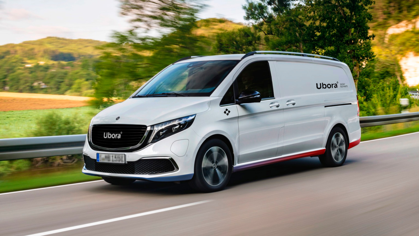
Brand touchpoints
The development of the Ubora universe is reflected in applications that combine the strength of the color palette with the purity of white, always adapting to the context in which they are displayed.
In those applications that reinforce the human aspect of the brand, color has a greater predominance, while in those that emphasize technology, the primary colour is white.
This is especially reflected in the chosen, corporate style of photography, which applies birds-eye, zenith planes combined with two types of flares: communications aimed at the consumer apply warm tones, whilst for those focused on the R&D and Innovation aspects, cold flares are used.
The photographic universe acquires special prominence in this project, since a style and framing was established that integrates the user in the privileged framework from which Ubora can contemplate the world; the place from where to carry out such precise measurements that allow Ubora to give their clients the exact and automated calculation to optimize their photovoltaic installation: satellite view. The use of absolute zenith perspective in all images contributes to placing the user beyond the stratosphere. A point of view reserved only for the most technologically advanced companies in the world.
Closing
Ubora's identity posed a challenge: how to unite two worlds that, although close, have always been presented as very distant. Our commitment has been to give relevance to a 100% Malaga born product with global projection, which makes use of the most cutting-edge geolocation technology in the European Union, joining their team to find an answer that put them at the forefront of the renewable energy market.